Ten-24 Inc. Dashboard Design
Through stakeholder insight, CEO insight, and existing research the company has conducted I have put together an accessible, user-friendly dashboard page that allows users to see all of their business statistics and information.
5 Min. Read
Year
2024
Client
Ten-24 Inc.
Role:
User Experience Lead

“We are looking to create a dashboard system that will allow property managers to view all their upcoming appointments. View all their properties. And be able to see the contact info of contractors they have previously worked with.”
- CEO of Ten-24 Inc. Michael Wojciechowski
Turning Insight Into Design…
Through CEO insight and stakeholder insight I had a firm understanding of the direction this design will go in, in order to satisfy user’s needs and business needs. The main components the dashboard needed according to the insight I was given by the CEO are:
User’s company information
Active jobs section
Requested jobs section
Saved client information section
Bonus: add a statistical graph showing job acceptance rate of user
LOW-FIDELITY DESIGN
LOW-FIDELITY DESIGN
Using Figma, I translated my first sketches into low-fidelity wireframes. The goal from the low-fidelity is to pinpoint where I would put all the information required. Through my first iteration I felt confident I was able to input all the necessary content the CEO and stakeholders requested
Creating sections will help users identify and separate categories easier
Adding edit and manage links will allow users to identify that all their content is editable.
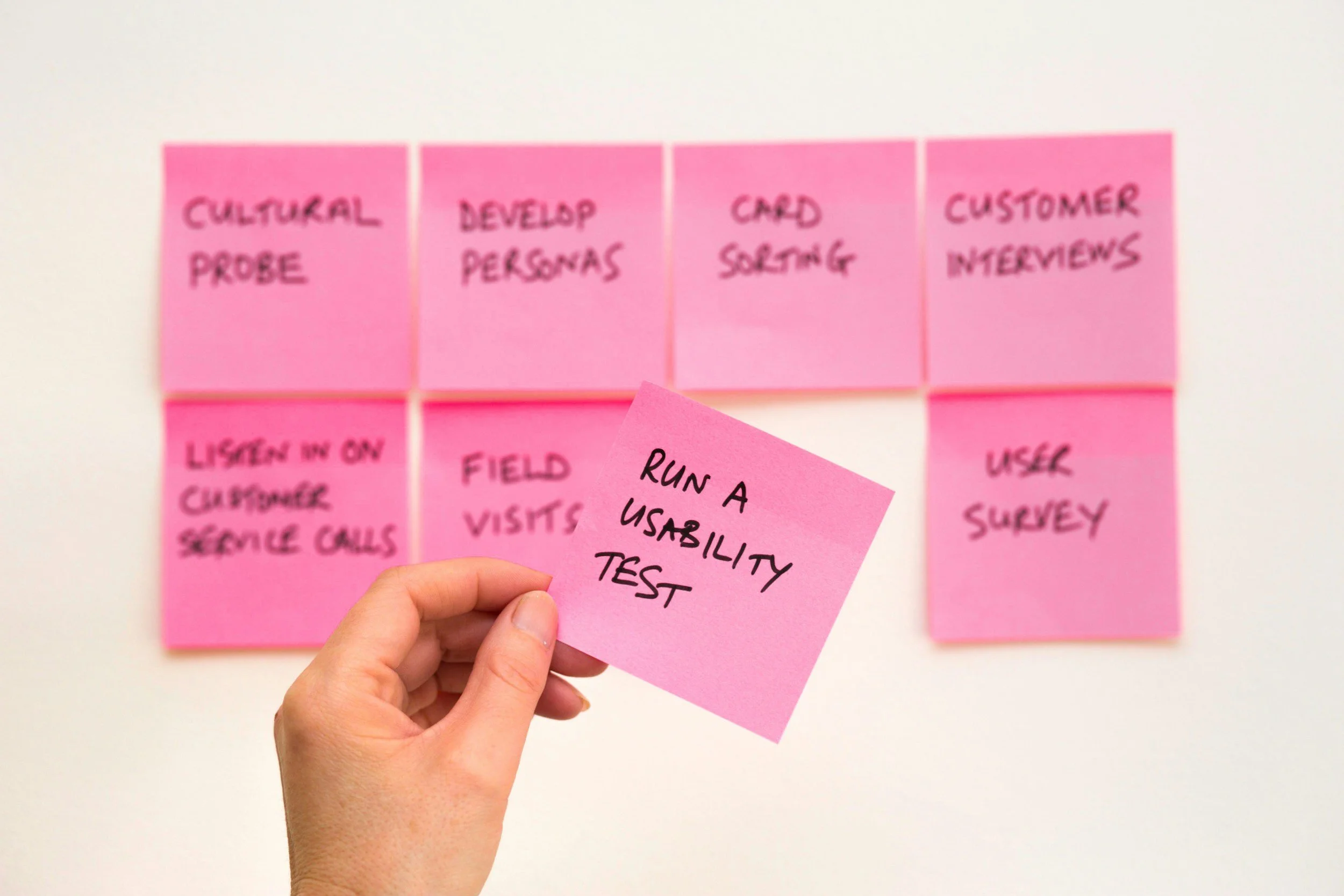
Test! Test! Test!
I created a script for user testing to build a better understanding of how customers find and interact with the service and to discover opportunities for improvement. The testing revealed some user problems in terms of time on task. Therefore, I paid special attention to this stage during the high-fidelity design process.
I wanted to find out KPIs when conducting user testing
Through in person testing I examined points users would take longer on during a task
The purpose of this was to identify how smooth the user-flow is for important aspects of the design
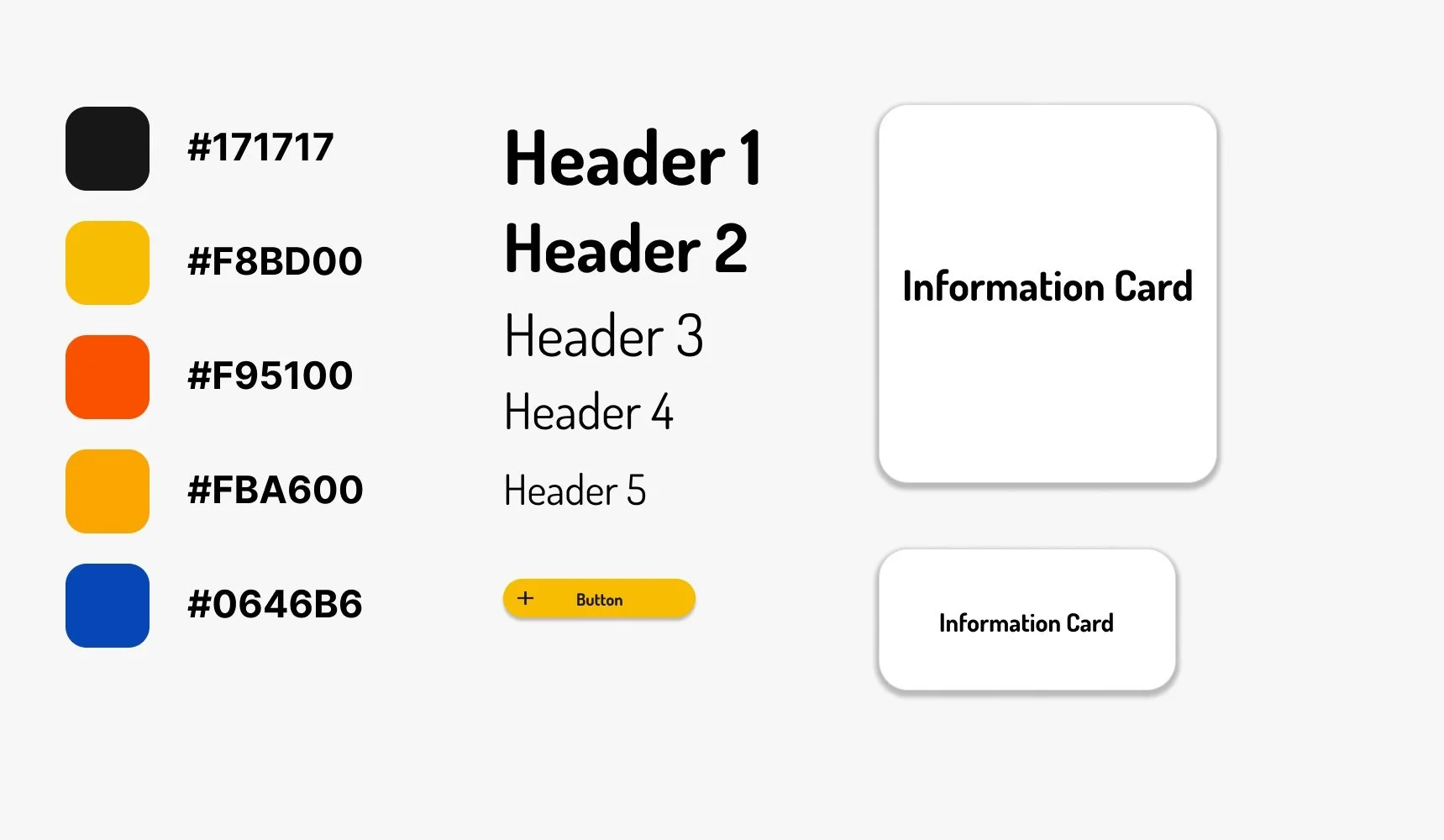
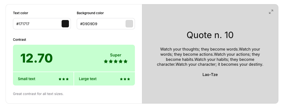
Design System & Accessibility Check
Check out the colour palette, typography, buttons, links, and hierarchy I used in order to create the high-fidelity design of this dashboard. All background and text gradients passed Coolors accessibility checks with a “super” rating.
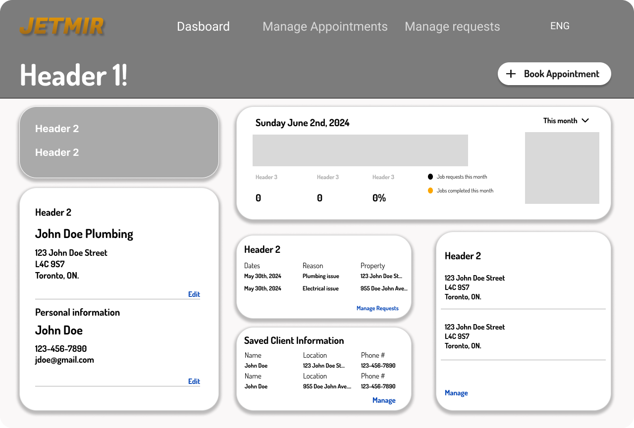
HIGH-FIDELITY UI DESIGN
HIGH-FIDELITY UI DESIGN
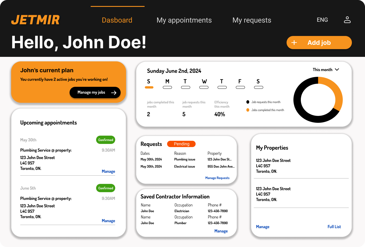
Once it was conrifmed all KPI standards were met through initial testings, I moved on to design the final screens in Figma. My goal was to create a visual identity that’s aligned with the brand’s values. Also, I’ve checked the competition and took a deep dive into my catalog of references for inspiration.
Used a more Dark & Creative visual style
Followed a Material Style Guideline
Designed for Web
What I Learned.
-
User's tend to have an easier journey when information is categorized and seperated into sections.
User Journey Learning
-
Colour coating sub-headings can be used as an effective way to relay messages or to guide users towards what they are looking for
UI Learning
-
Leading the UX Initiative for a project entails of building those bridges and connections between; Stakeholder - user - Management. Ensuring all needs are met through your research and design
UX Learning