Fintrak Onboarding & Home Screen Design
As Fintrak started to gain stakeholder trust and collect funding I had the privilege of being reached out to by the founder of Fintrak in order to design and test their mobile onboarding as well as conduct UX research for the project at hand.
Role
UX & UI Designer
10-15 Min Read
Year
2023
Client
Freelance Contract
Problem At Hand…
Users are struggling to track their monthly costs due to the abundance of subscriptions & memberships that they have and it is setting them back on their ideal short and long term financial goals.
Our Solution:
Through user testing and iteration I was able to put together an onboarding sequence that was user-friendly and informative. All while meeting KPI's set out by stakeholders and developers.
Let’s Get to Know Our Users
During the ideation phase of the project, I conducted user interviews to build new personas and to inform the design. I prepared an interview script with 6 open-ended questions, focusing on our target audiences’ values, motivations, and daily routines. In 4 days, I recruited and interviewed 5 users remotely. I will be referencing the user interview findings throughout the entire design process.


Interview Focus
Questions were focused on users' finances & financial planning
This segment contained 5 user interviews
Majority of users struggle to track their monthly expenses and almost all users did not know exactly how much they spend on subscriptions and memberships a month
After discovering these findings they were put into a priority matrix in order to identify the most common problem users faced
The most common problem users face is firstly; not knowing how much their subscriptions are costing them a month all together, secondly; forgetting about certain memberships and not using their services consistently or at all in some cases
Link to full user answers: https://www.figma.com/file/A5PSH72uEjxi4jFl1L9Iy1/ManageMe?type=whiteboard&node-id=0%3A1&t=Rz22hIIkjWz6y5Mo-1
Let’s Think Like A User Now
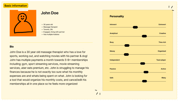
I wanted to form a deeper understanding of my users' goals, needs, experiences, and behaviours. So, I created a persona based off of the struggles and habits users stated they had in their user interviews. I refer back to this user persona throughout the project in order to keep my solutions focused on the initial problems at hand
I decided I needed a persona in order to understand our users and how they could benefit from our application
The data used to build this persona is from the answers given (insights) within the user interviews (full interview results is above)
This persona covers personality, struggles, and goals
This persona kept my vision clear and didn't allow me to get side tracked when designing a solution for it's problems
I would reflect back to this as i was designing the solution.
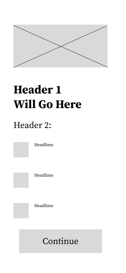
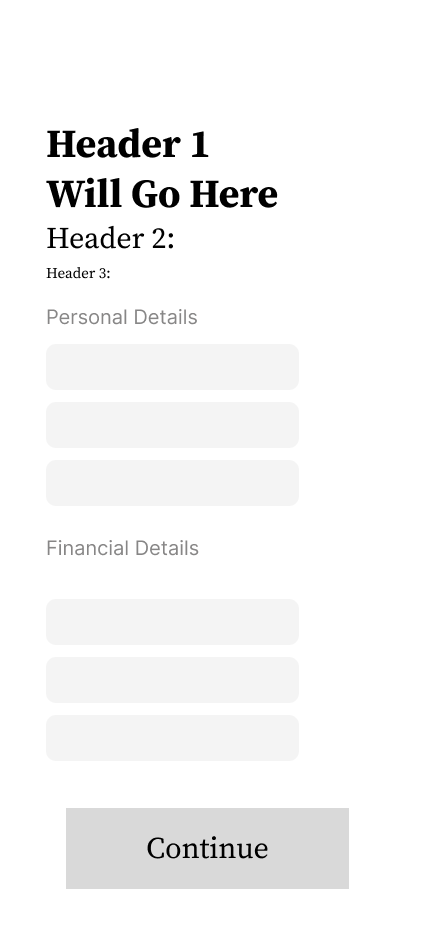
LOW-FIDELITY PROTOTYPES
LOW-FIDELITY PROTOTYPES
After I've identified the problems, I now begin to design the solutions! Using Figma I put together a low fidelity prototype & wireframe which focuses on the main goal; can users easily punch in their monthly subscriptions and costs in a quick and efficient manner? Below you will see firstly; the prototype, and secondly, test results from 5 user tests,
User testing focused on efficiency & simplicity
Simplicity: straightforward placements and visual hierarchy based on importance of information
Efficiency: All important functions can be found on the home page and very easy to access. Monthly cost will be aim for first thing users should notice when entering application
Secondary focus was related to motivating users to focus more on their finances
The entire wireframe from start to finish was tested
Users were finally asked for potential improvements.
Testing User Journey
After I created a fully functioning wireframe for my low-fidelity prototype I asked 5 users to complete various tasks in addition to spot various functions in order to comprehend how simple the functionality of my application is, and if this is an application they could benefit from. I then asked users what improvements would they make, why was the function easy or difficult, and if this were this project; what would they add or take out? Here are the issues users encountered during these usability tests:
issue 01
Search Vs Navigation KPI was lacking
Many users found the idea of scrolling through many subscriptions and memberships tedious, especially since a user stated they have more than 15 active subscriptions/memberships.
solution 01
Incorporate a search function for users
We understand some users might have many subscriptions therefore instead of having them scroll through a list of subscriptions we've incorporated a search function so users can search for a specific subscription that they have!
Issue 02
Categorization
Users were hoping to see their expenses put into categories so they can see where most of their money goes into (i.e entertainment, clothing, groceries, subscriptions, etc). In addition one user stated they would be highly interested to have the ability to compare their last months spending to this months
Solution 02
Incorporate graphing system that tracks month to month expenses & add a feature that shows users where most of their spending goes
By integrating a graph that shows users their month to month spending, users will have an easier time understanding how their savings and income is being effected by their expenses every month. In addition, adding a feature where users can see the categories they spend the most in will help users understand better where their money is going every month.
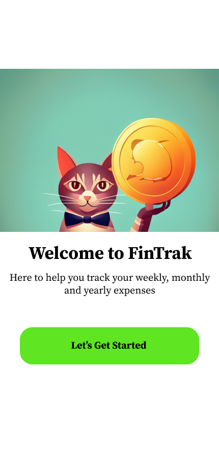
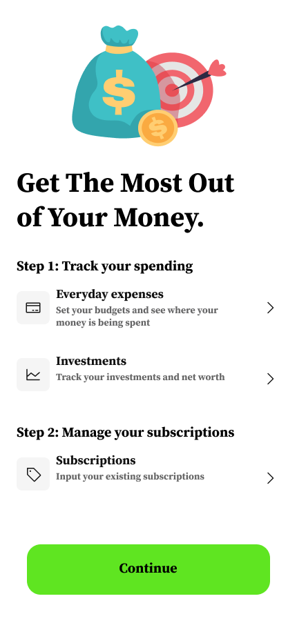
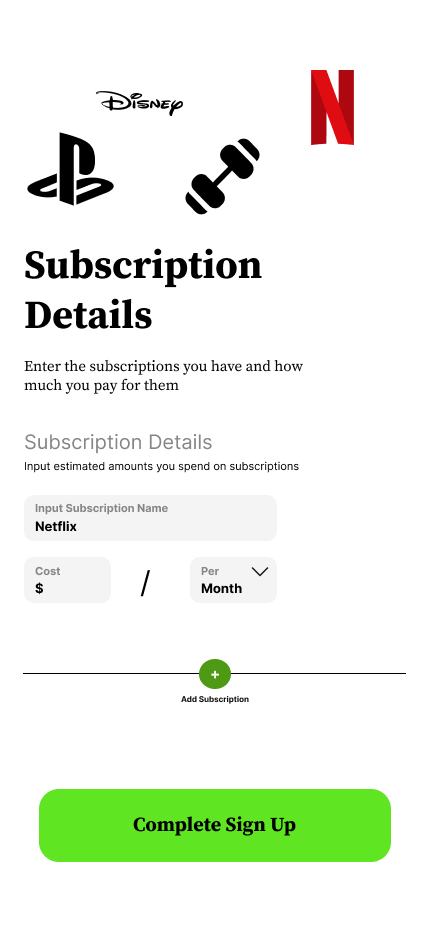
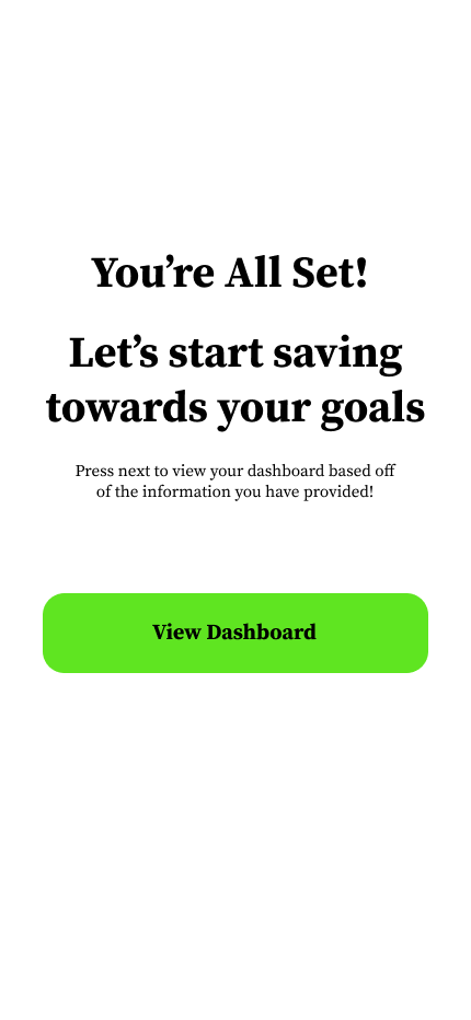
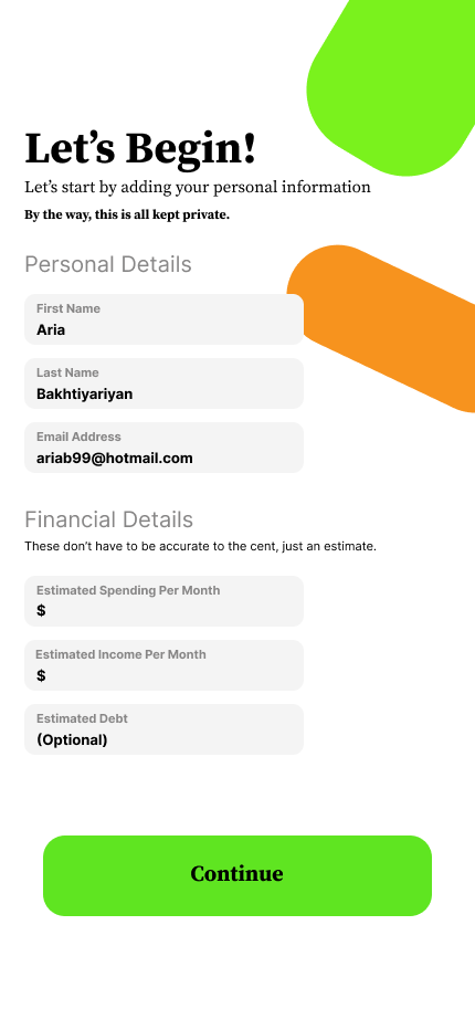
High-Fidelity UI Designs - Onboarding
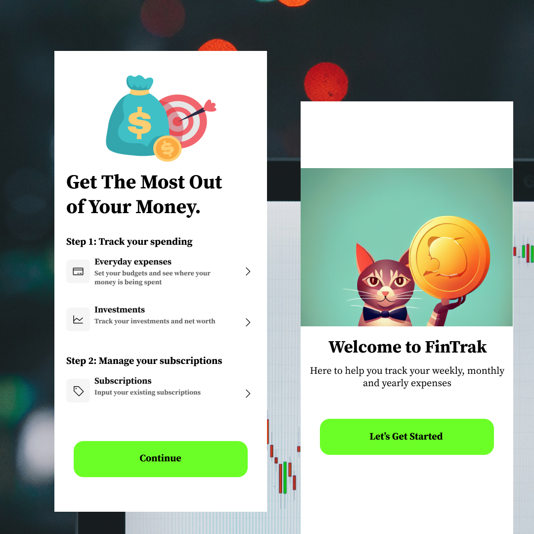
Once the usability issues were resolved, I moved on to design the final screens in Figma. My goal was to create a visually appealing and simple to navigate UI. by using the primary colours of green white and black (all texts and colours passed accessibility testing) I put together a design that will allow users to easily perform the important tasks at hand (add & remove memberships, see their monthly spending, identify where they are spending the most)
The first impression is always important! With a focus on simplicity and security I focused the onboarding routine on reassuring users that this app is easy to use, and most importantly safe to use. Onboarding is where most of my expertise was used during this project.
What I Learned.
-
During the research phase of this case study I've come to realize people value applications much more when it makes their day to day lives easier. For instance, before I began this case study I put up a poll on instagram asking "who would actually use an app like this", come to find out over 80% of the people who voted; voted yes!
UX Research Learning
-
There are less drop off rates when users go through a informative and visually pleasing onboarding sequence when opening an app
UX & UI Learning
-
Implementing a graph of users' expenses enhanced the user experience since they had a visual queue of seeing how they spend their money
UI Learning