GreenThumb Application development
This collaborative project was put together by myself and four (4) other UX designers. Through multiple rounds of interviews, low-high fi prototyping and constant & productive communication, we've put together a full end-to-end front end development project
10-15 Min. Read
Year
2022
Client
Freelance Project
Role:
UX Designer - Interviewing|User Journey|High Fidelity Prototyping
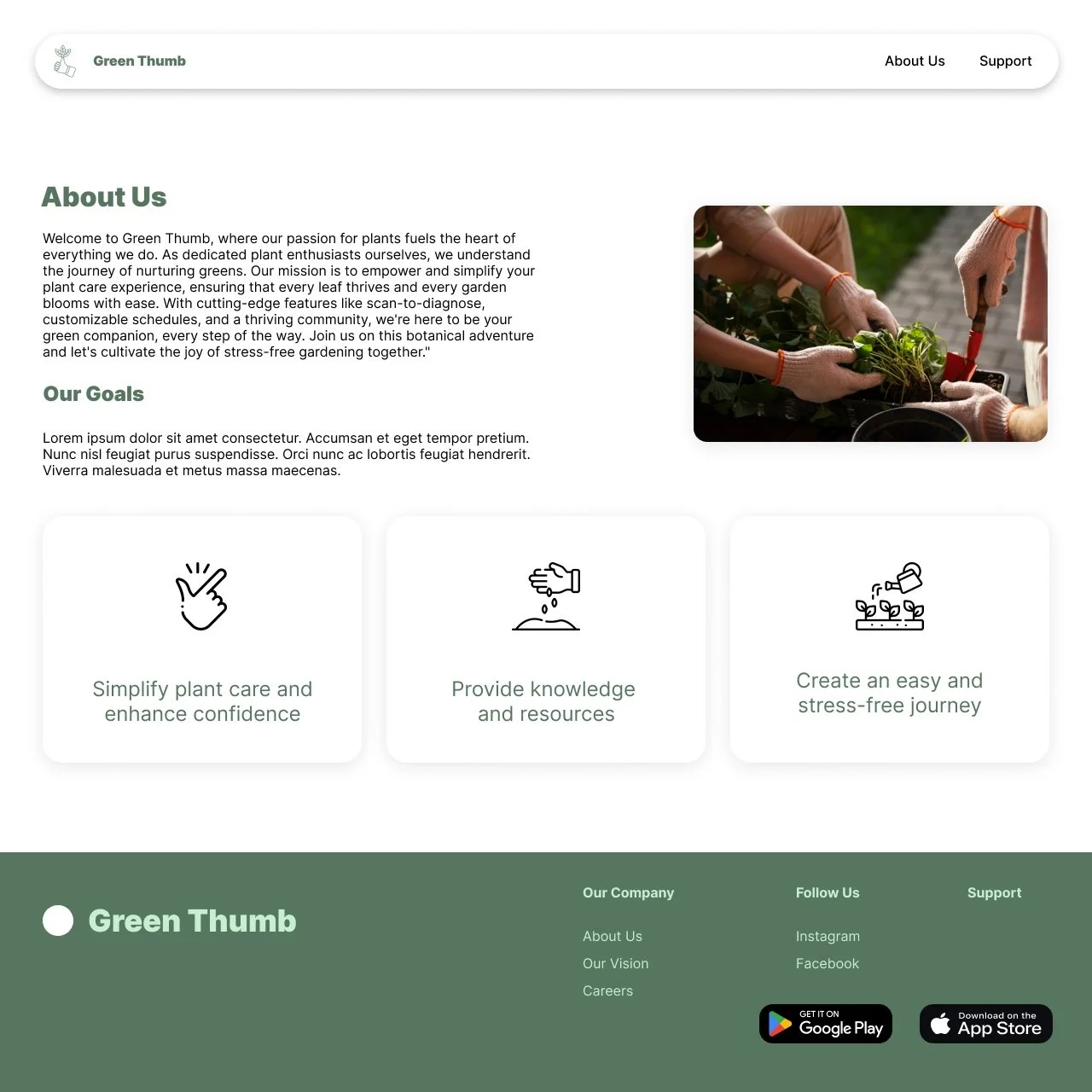
The Problem At Hand
Users who love plants and gardening feel that they don't have the time and resources to care for their plants effectively, resulting in challenges like improper watering, inadequate lighting, and plant diseases, and find they lack time to learn key information to grow their own plants at home.
Our Solution:
An App with personalized plant care schedules, real-time tips on watering and lighting, and a comprehensive knowledge hub that empowers plant enthusiasts to nurture thriving green companions effortlessly, even in busy lifestyles.
Let’s Interview Our Users!
During the ideation phase of the project, we conducted user interviews to build new personas and to begin formulating an idea for our design problem. Together with the team, we prepared an interview script with both open-ended & closed-ended questions, focusing on our target audiences’ values, motivations, and daily routines when it comes to plant care and time management. Within a week we managed to conduct 6 user interviews and added their responses into an affinity diagram in order to sort and organize them. We referenced the user interview findings throughout the entire design process. Here are some key topics our interviews focused on:
Understanding the relationship plant owners have between their plants and gardens.
Identifying the paint points that plant owners experience when taking care of their plants/gardens and how it affects their motivation and mental health.
Is there a connection between mental health and plant care, and how can we design around that idea if there is?
How can we come up with solutions that separate us from other plant care apps
Link to full interview results: https://www.figma.com/file/gNpsUXBZrfAXtSKzzZxdFh/GreenThumb-%2F-Affinity-Diagram?type=whiteboard&node-id=0%3A1&t=54IWT8R1kbFcw2U2-1

Let’s Go On A (Users) Journey!
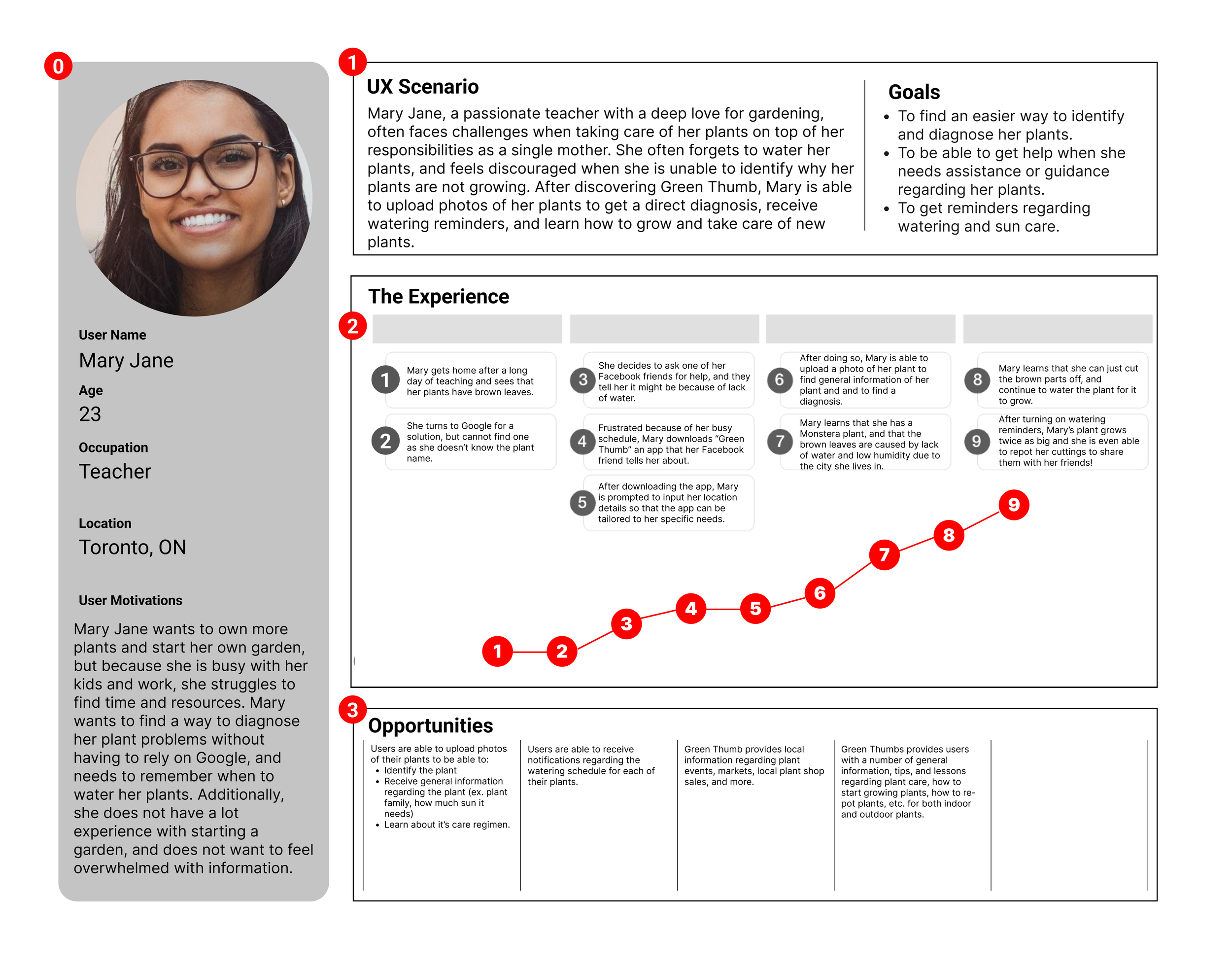
With the end goal in mind, we made sure that our users find the information they need without any hiccups. So, we sketched a current-state user journey map, to identify opportunities for improvement. We ended up identifying one (1) potential drop off point during the flow which was later addressed in the first iteration of the prototypes, allowing for a quicker and smoother user journey.
This journey map was tested with our low-fi prototype
The map was validated once it was clear users can complete all tasks and navigate the app with ease
During our journey mapping, we found a drop off point when it came to adding a plant to a library
LET'S START WIREFRAMING!
LET'S START WIREFRAMING!
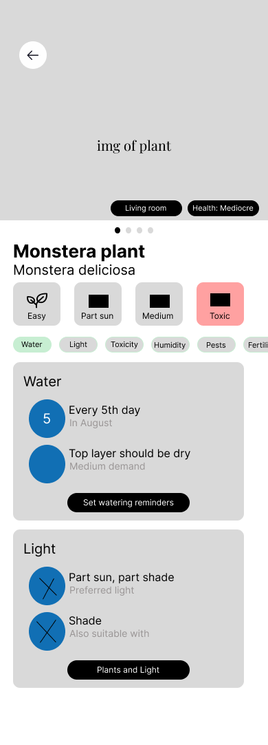
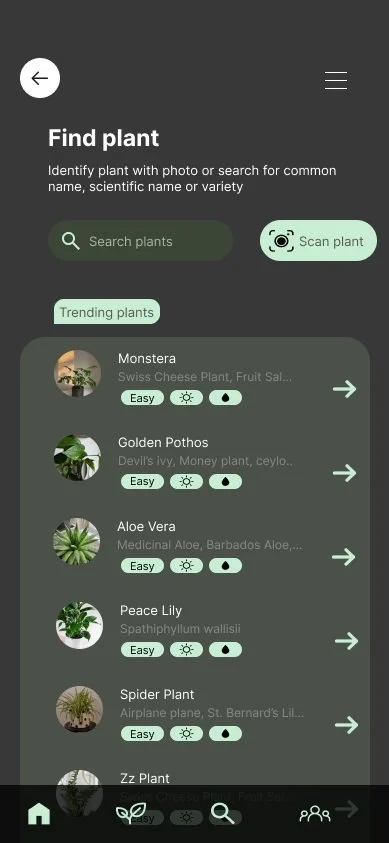
Using Figma, I translated my first sketches into low/mid-fidelity wireframes. As a team we had a larger focus on being able to display informations on plants and making pages as resourceful as possible by being able to input as much relevant information needed for a plant. At this stage, the wireframes were defined enough for some user testing. Based on 5 tests, we've made a few alternations and moved on to creating high-fidelity prototypes.
Large focus on information output
Figma & protopie were used for prototyping
2 iterations of mid-fidelity wireframes were made


Time To Test…
Once our iterations were completed we conducted 5 user tests via zoom in order to identify the usability status of our main key features and to see if we were on the right track for our information and resource output. Some tasks that we asked users to complete consisted of:
Scanning a plant in order to receive a diagnosis
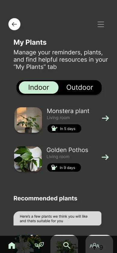
Adding a plant to your home page
Setting up watering reminders for your plant
Finding the appropriate resources to aid in your gardening experience
issue 01
User flow was inconsistant and incomplete
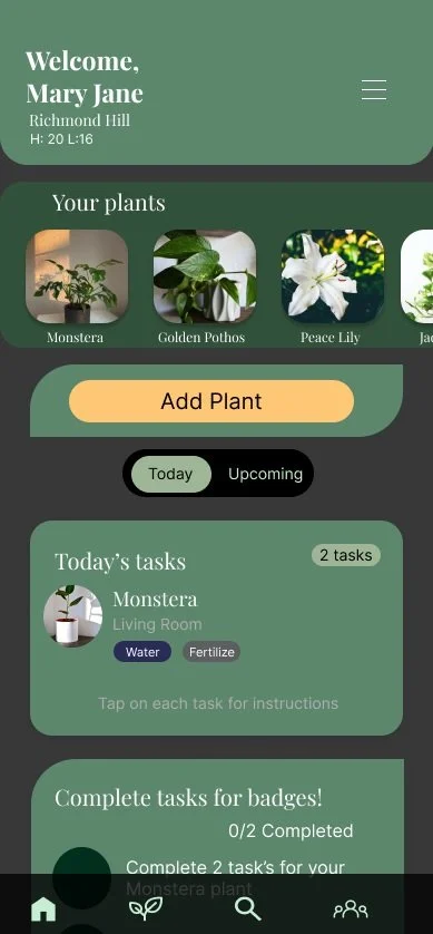
Users struggles to navigate through the app from missing back buttons and essential buttons such as a "add plant" button were missing on the plants information page, thus stumping users within their tasks
solution 01
Reiterate pages and assure there is consistency with buttons
As a team we made sure each page had a back button and a bottom nav bar that allowed users to navigate the application easier, in addition to adding a stand out 'add plants" button!
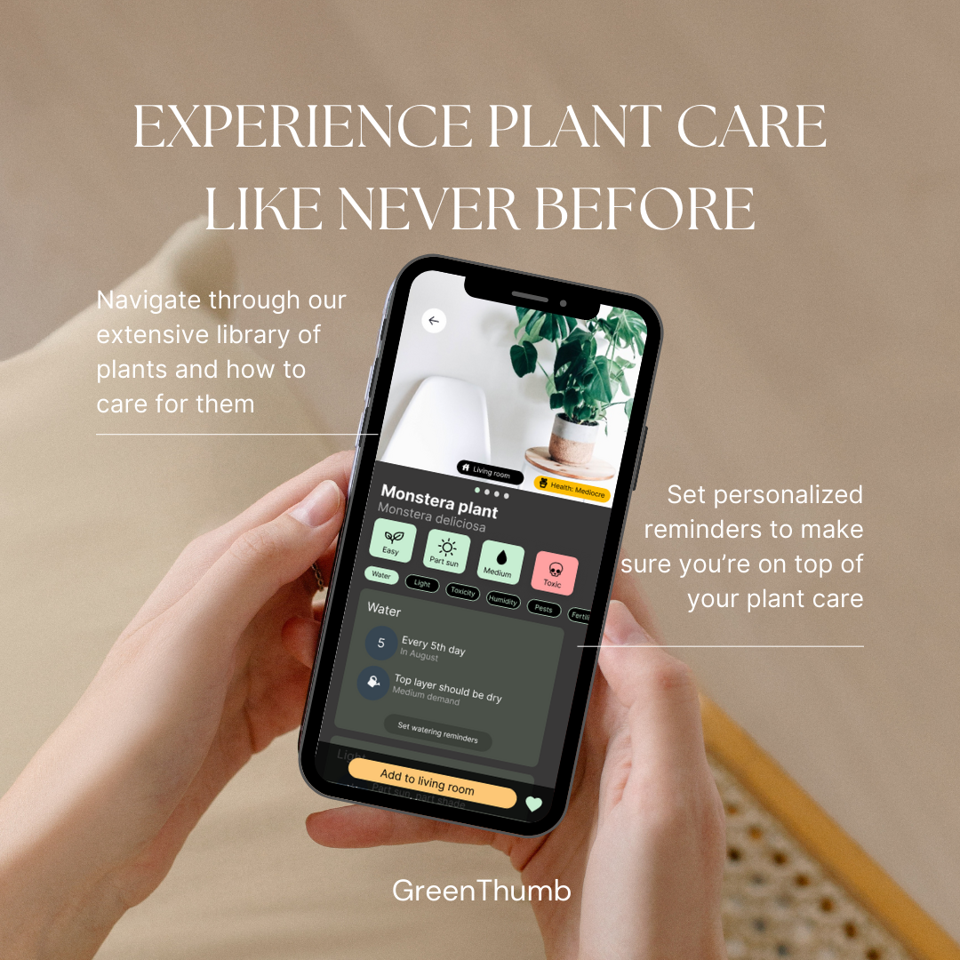
Let’s Make Things Fancy!
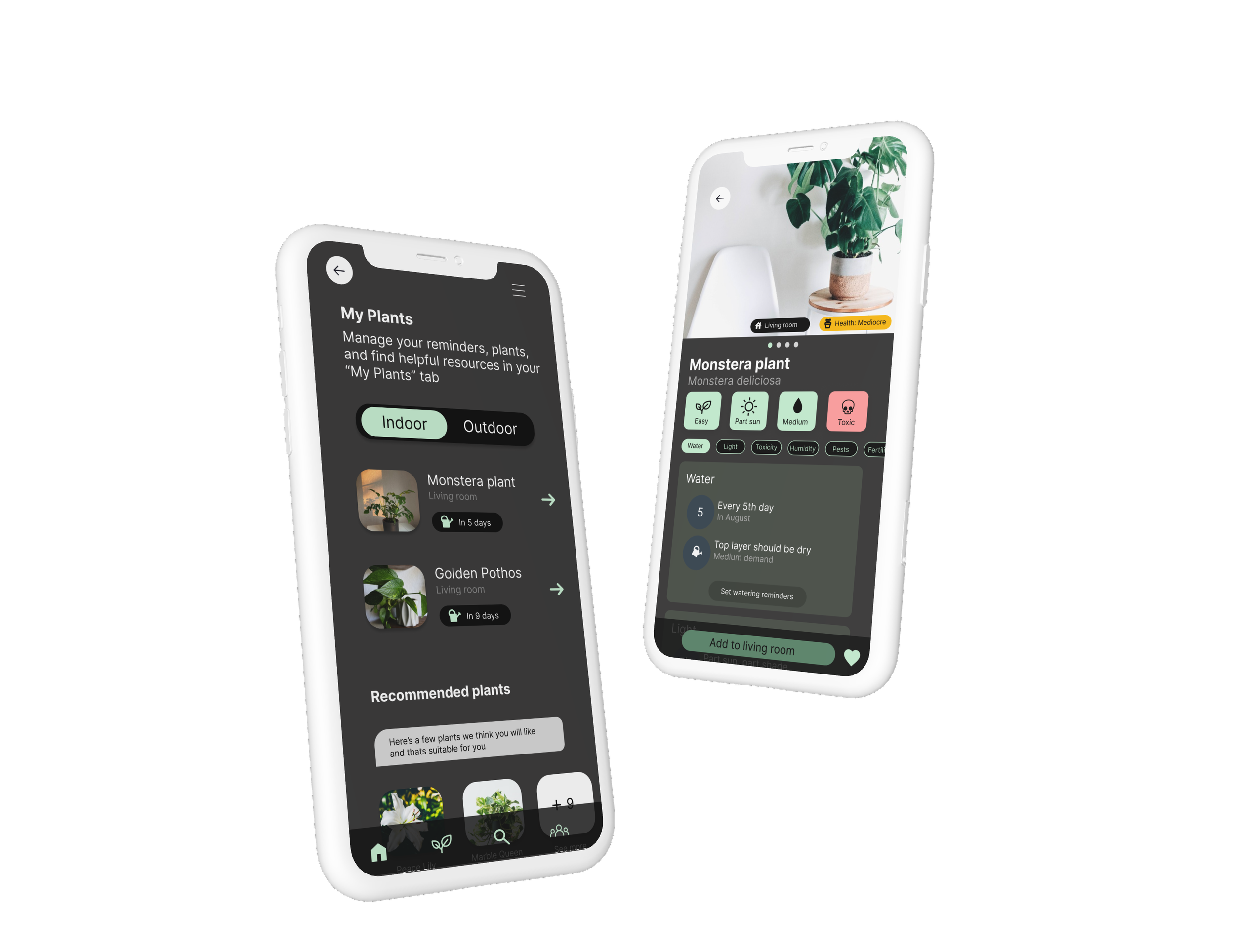
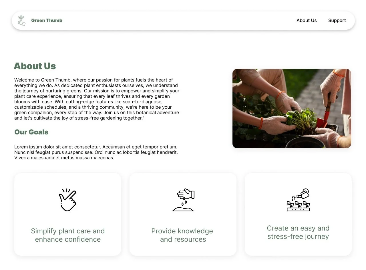
Once the usability issues were resolved, I moved on to design the final screens in Figma. Our goal was to create a consistent and intriguing design that will engage users into their plant care journey. We carried a green/earthy theme (all colour schemes passed accessibility testing) and used stand our colours in specific areas in order to maintain direction for users (i.e important buttons have a stand out colour).
We went with a dark visual style
For certain pages we followed IOS guildlines (log-in & onboarding)
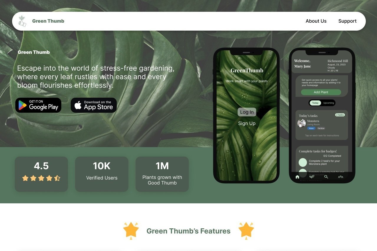
We designed for Mobile and Desktop
Our final design is a representation of our initial goals and everything we learnt from our users.
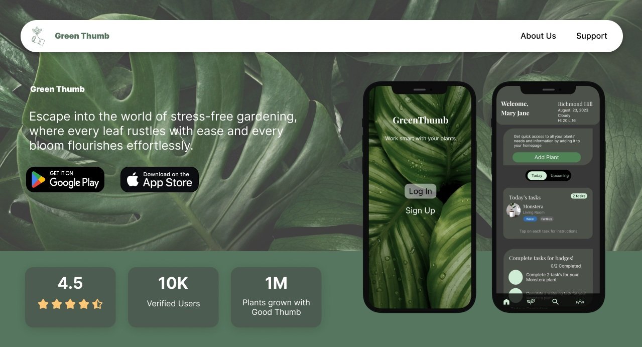

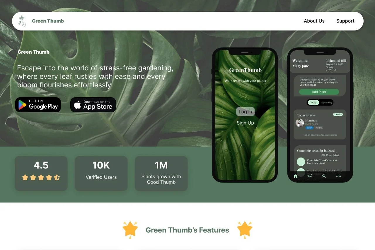
Let’s Get Coding!
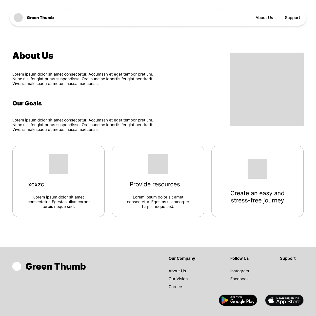
After our mobile segment was completed, we then translated the design into desktop. Using HTML & CSS we then brought our desktop variation to life! Here are some key takeaways from our desktop version:
Used more as a informations page about our mobile application and what it is used for and who it is intended for
Both a mid-fi and a high-fi iteration were designed with only the high-fi being coded
All colour schemes in design have passed accessibility testing with ease
HTML , CSS & Bootstrap were used to put this segment together
After completing our designs in Figma, we then translated them to code!
Link to github code: https://github.com/JessicaPirak/UX_UI_HW_21-GreenThumb
Link to webpage: https://jessicapirak.github.io/UX_UI_HW_21-GreenThumb/
What I Learned.
-
The entire coding process was a journey for me. This was the first application I've had to code and bring to life!
Development Learning
-
User's appreciate simplicity. Simple button's. Simple layout. Simple colour scheme. I've learnt to keep designs simple and not over-do a design.
UI Learning
-
Our User's drop off rate was much higher before we placed a "add to room" button
UX Learning